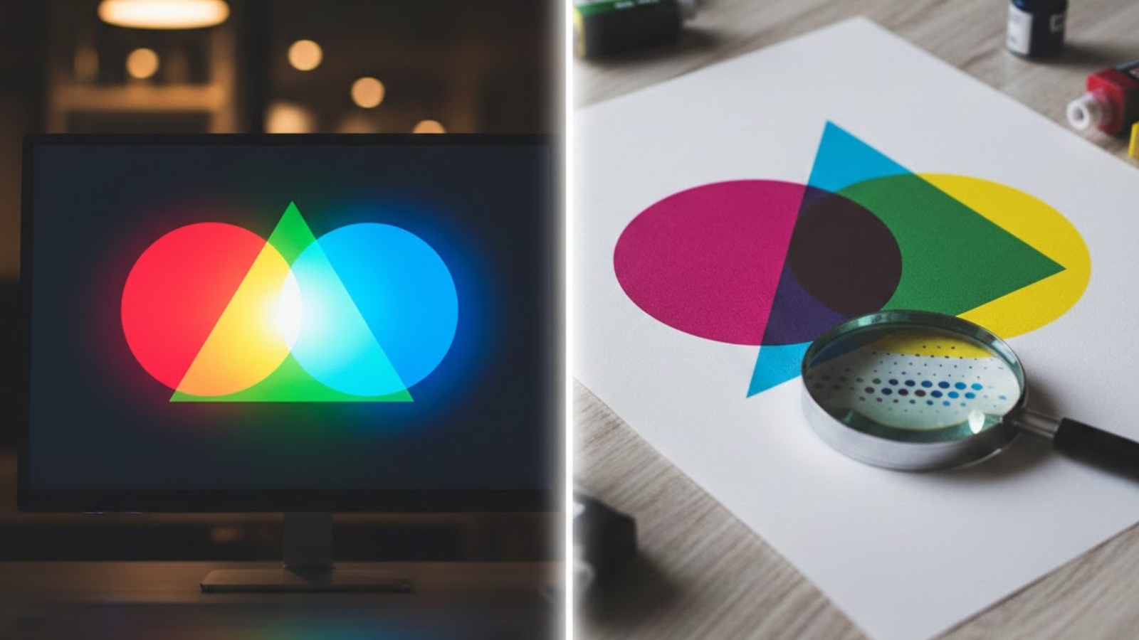
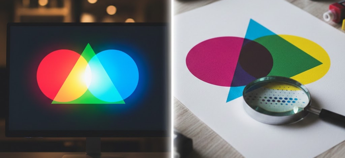
You’ve spent hours perfecting your design on screen—the vibrant blues pop, the reds are bold, and everything looks exactly right. Then your printed materials arrive, and the colours look completely different. Duller. Flatter. Wrong.
This scenario plays out daily for businesses across the Niagara Region, and it’s not your printer’s fault. The culprit is the fundamental difference between how screens display colour (RGB) and how printers reproduce colour (CMYK).
Understanding these two colour systems is essential for anyone creating marketing materials, branding elements, or any printed content. Let’s decode the mystery of CMYK vs RGB so your next print project matches your vision perfectly.
At Niagara Print Express, we help Niagara Region businesses achieve consistent, accurate print colours through expert file checks, proofs, and colour consultation.
RGB Explained: How Screens Create Colour
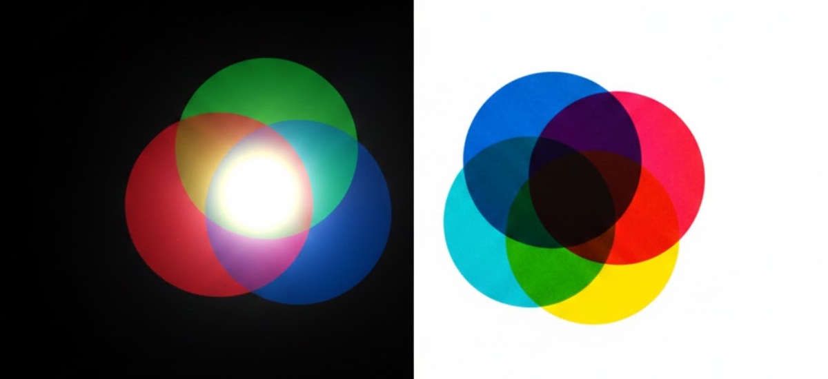
RGB stands for Red, Green, and Blue—the three colours of light that your computer monitor, smartphone, and television use to create every colour you see on screen.
How RGB Works
RGB is an additive colour model, meaning it creates colours by adding light together:
- Start with darkness (black screen)
- Add red, green, and blue light in varying intensities
- When all three colours combine at full intensity, you get white light
- Different combinations create millions of possible colours
Your screen displays colour using tiny pixels that emit red, green, or blue light. By controlling the intensity of each colour in each pixel, screens can create approximately 16.7 million different colours.
Why RGB Looks So Vibrant
Screens emit light directly into your eyes. This is why colours on your computer look so bright and vivid—you’re literally looking at light sources. RGB can create intensely saturated colours that simply glow, especially bright blues, greens, and neon shades.
The RGB colour space is massive, giving digital designers an enormous palette to work with. However, this creates a problem when transitioning from screen to print.
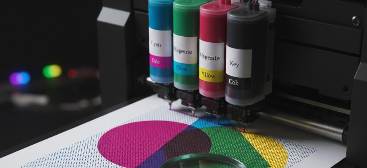
CMYK Explained: How Printers Reproduce Colour
CMYK stands for Cyan, Magenta, Yellow, and Key (Black)—the four ink colours used in professional printing services throughout Ontario and worldwide.
How CMYK Works
CMYK is a subtractive colour model, which works in the opposite way to RGB:
- Start with white (the paper)
- Add cyan, magenta, yellow, and black inks
- Each ink absorbs (subtracts) certain wavelengths of light
- The combination of inks determines what light reflects back to your eyes
- More ink means less light reflected, resulting in darker colours
Unlike screens that emit light, printed materials rely on reflected light. When you look at a printed brochure, you’re seeing light from your environment bouncing off the paper and inks—a fundamentally different process than looking at a glowing screen.
The CMYK Colour Gamut Limitation
Here’s the critical issue: CMYK can reproduce far fewer colours than RGB. The CMYK colour space is significantly smaller, meaning many vibrant RGB colours simply cannot be printed using standard four-colour printing.
Colours that exist in RGB but can’t be matched in CMYK are called “out of gamut.” When you convert an RGB design to CMYK, these out-of-gamut colours get automatically shifted to the closest CMYK equivalent—which often means they become noticeably duller.
Why Your Screen Colours Don't Match Printed Results
Now that you understand both systems, let’s explore exactly why that disconnect happens between what you see and what you get.
The Physics Problem
Think of it this way: your screen is like a flashlight shining coloured light into your eyes. Your printed piece is like looking at a painting—you’re seeing reflected ambient light, not emitted light. A flashlight will always appear brighter than reflected light, no matter how vibrant the paint.
This fundamental physics limitation means that:
- Bright blues often print much darker and less electric
- Vivid greens lose their neon quality
- Hot pinks and magentas become more muted
- Gradients may show banding or stepping
- Screens appear brighter overall compared to printed pieces
Common Colour Shift Examples
Based on our experience at Niagara Print Express, these colours cause the most disappointment when businesses see their first proofs:

- On screen: Bright, glowing, almost neon
- In CMYK print: Becomes a darker, more subdued royal blue
- Colour shift: Approximately 30-40% less vibrant

- On screen: Bold, energetic, high-impact
- In CMYK print: Slightly more muted, tends toward red-orange
- Colour shift: Noticeable saturation loss

- On screen: Brilliant, neon-like, highly saturated
- In CMYK print: Becomes more of a grass green, loses brightness
- Colour shift: Significant—often the biggest disappointment

- On screen: Rich, deep purples achievable
- In CMYK print: Often shift toward blue or appear muddier
- Colour shift: Particularly difficult to match accurately
A Niagara Region tech startup learned this the hard way last year. Their brand used a vibrant electric blue (#0066FF) that looked spectacular on their website. When they printed 5,000 business cards without converting to CMYK first, the blue came out looking almost navy. The reprint cost them $400 and delayed their product launch event.
How to Prevent Colour Disappointment
The good news? Once you understand CMYK vs RGB, you can take specific steps to ensure your printed colours meet your expectations.
Design in CMYK from the Start
If your project will be printed, set up your design files in CMYK colour mode from day one. This shows you the actual printable colours while you’re designing, eliminating surprises later.

In Adobe Illustrator:
- File > Document Color Mode > CMYK Color

In Adobe Photoshop:
- Image > Mode > CMYK Color

In Adobe InDesign:
- Edit > Color Settings > Working Spaces > CMYK
When you design in CMYK mode, out-of-gamut colours won’t even appear as options. This constraint helps you make design decisions based on what’s actually achievable in print.
Use Soft Proofing
Soft proofing simulates how your design will look when printed, right on your screen. While it’s not perfect (you’re still looking at an RGB screen), it gives you a much more accurate preview than viewing RGB files.
In Adobe Photoshop:
- View > Proof Setup > Working CMYK
- View > Proof Colors (toggle on)
In Adobe Illustrator:
- View > Proof Setup > Customize
- Select your CMYK profile
- View > Proof Colors
You’ll immediately see colours shift to their CMYK equivalents. That vibrant green might suddenly look much more subdued—and that’s exactly how it will print.
Request Printed Proofs for Critical Projects
For important projects like company branding, annual reports, or high-volume marketing campaigns, invest in printed proofs. At Niagara Print Express, we can provide physical colour proofs that show exactly how your final piece will look.
A printed proof costs $25-75 depending on the project size, but it can save you thousands in reprints. For one Pelham-based client’s rebrand, a proof revealed their new purple was printing too blue. A simple adjustment before the full run saved them from reprinting 10,000 brochures.
Choose Print-Friendly Colours
Some colours translate beautifully from RGB to CMYK with minimal shift:
Print-Friendly Colours:
- Deep navy blues
- True reds (avoid neon reds)
- Earth tones (browns, tans, olive greens)
- Most neutrals (greys, black, white)
- Burgundy and wine colours
- Forest greens
Problematic Colours:
- Electric/neon blues
- Bright lime greens
- Hot pinks and fluorescents
- Bright purples and violets
- Pure cyan or pure magenta at full saturation
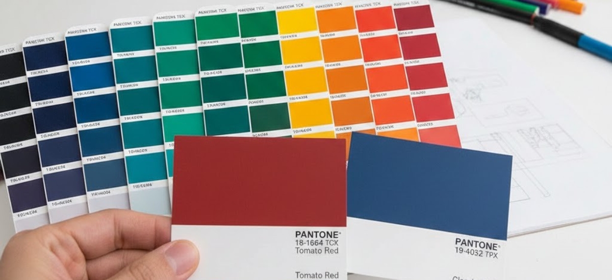
Understanding Pantone: The Third Option
There’s actually a third colour system worth knowing about: Pantone Matching System (PMS) or spot colours.
Pantone uses premixed inks rather than combining CMYK. Each Pantone colour is a specific formula, ensuring consistency across different printers and materials. If precise colour matching is critical for your brand, Pantone spot colours might be worth considering.
When to Use Pantone
- Your brand requires exact colour consistency across all materials
- You're printing on specialty materials (metal, plastic, fabric)
- You need colours outside the CMYK gamut (like metallic gold or bright orange)
- You're doing large-volume corporate branding
Keep in mind that Pantone printing typically costs 15-25% more than CMYK printing, so it’s usually reserved for specific branding applications rather than everyday marketing materials.
Monitor Calibration: The Hidden Factor
Even when working in CMYK, your monitor’s calibration affects what you see. An uncalibrated monitor might display colours that are too bright, too warm, or too cool—none of which match reality.
Basic Monitor Calibration Tips
For most businesses in the Niagara Region, professional monitor calibration isn’t necessary. However, you can improve accuracy by:
- Adjusting brightness: Your monitor shouldn't be the brightest thing in the room
- Setting colour temperature: Use 6500K (D65) for print work
- Reducing blue light filters: Turn off night mode when doing colour work
- Consistent lighting: View designs in similar lighting conditions each time
- Regular checks: Compare your screen to printed samples periodically
If you’re doing high-volume print work or professional design, investing in a hardware calibration tool ($150-300) can pay for itself by reducing colour-matching issues.
Converting RGB to CMYK: Best Practices
Sometimes you must start with RGB files (photos from smartphones, stock images, or web graphics) and convert them to CMYK for printing.
Conversion Steps in Photoshop
- 1. Check your image first: View > Proof Colors to preview the shift
- 2. Identify problem areas: Look for colours that shift dramatically
- 3. Make adjustments in RGB: Slightly modify problem colours before converting
- 4. Convert: Image > Mode > CMYK Color
- 5. Fine-tune in CMYK: Make final adjustments after conversion
- 6. Save a backup: Keep your original RGB file for web use
Never convert CMYK back to RGB and back to CMYK repeatedly. Each conversion loses information and degrades colour accuracy.
Real-World Success Story
A Niagara Falls tourism company came to us frustrated after several failed print projects with online printers. Their marketing materials—designed entirely in RGB—never matched their expectations.
We worked with them to:
- Rebuild their core templates in CMYK
- Create a custom colour guide showing their brand colours in both RGB (web) and CMYK (print)
- Establish a soft proofing workflow in their design process
The result? Their next 50,000-piece brochure campaign printed perfectly on the first run, saving them approximately $2,000 in previous reprint costs. More importantly, they now have confidence in their design-to-print process.
Quick Reference: CMYK vs RGB at a Glance
RGB Colour Model:
- Used for: Screens, digital displays, web design
- Colours: Red, Green, Blue
- Method: Additive (light combined)
- Colour range: 16.7 million colours
- Appearance: Bright, vibrant, glowing
- File extensions: .jpg, .png (for web)
CMYK Colour Model:
- Used for: Professional printing, commercial printing services
- Colours: Cyan, Magenta, Yellow, Black
- Method: Subtractive (light absorbed)
- Colour range: Smaller subset of colours
- Appearance: Muted compared to RGB, relies on reflected light
- File extensions: .pdf (print-ready), .ai, .indd
Key Takeaways: Master Colour Mode for Perfect Prints
Understanding CMYK vs RGB doesn’t require a degree in colour science. Focus on these essentials:
- Design in CMYK when your project will be printed—set it up correctly from the start
- RGB colours appear brighter because they emit light; CMYK prints reflect light and appear more muted
- Use soft proofing to preview CMYK colours while designing in Adobe software
- Request printed proofs for critical branding and high-volume projects
- Not all colours are printable—bright blues, lime greens, and neons shift the most dramatically
By following these guidelines, you’ll bridge the gap between screen and print, ensuring your marketing materials look professional and meet your expectations every time.
Your Colour Accuracy Partner
At Niagara Print Express, we understand that colour accuracy can make or break your marketing materials. Our team has years of experience helping businesses throughout Pelham and the Niagara Region achieve the colours they envision.
We offer:
- Free file reviews to check colour modes before printing
- Colour consultation for brand-critical projects
- Printed proofs to ensure colour accuracy
- Expert advice on RGB-to-CMYK conversion
Don’t let colour confusion cost you time and money on reprints.
Have questions about your printing needs? Our team at Niagara Print Express is here to help. Visit us at 145 Hwy 20 E, Pelham, or call (289) 897-9026 to discuss your project. Let’s make sure your colours print perfectly the first time.

We print almost everything!
Didn't find what you're looking for?
We print almost everything! Contact us for custom requests.
Frequently Asked Questions (FAQs)
Why do colors look different when printed compared to on screen?
Colors look different because screens use RGB light to display color, while printers use CMYK ink on paper. RGB emits light directly into your eyes, making colors appear brighter, while CMYK relies on reflected light, which naturally looks more muted.
What is the main difference between RGB and CMYK color modes?
RGB is an additive color model used for digital screens, combining red, green, and blue light to create colors. CMYK is a subtractive color model used in printing, combining cyan, magenta, yellow, and black ink to absorb light and produce color on paper.
Why do bright blues and greens print poorly in CMYK?
Many bright blues, lime greens, and neon colors exist outside the CMYK color gamut. When converted from RGB to CMYK, these “out-of-gamut” colors are automatically adjusted to the nearest printable color, resulting in noticeable dulling or color shifts.
Should I design in CMYK or RGB for printing projects?
If your project will be printed, you should design in CMYK from the start. This allows you to see realistic, printable colors while designing and avoids unpleasant surprises after printing.
What is soft proofing and why is it important?
Soft proofing simulates how your design will look when printed by previewing CMYK colors on your screen. While not perfect, it helps identify color shifts early and reduces the risk of costly reprints.
When should I consider using Pantone colors instead of CMYK?
Pantone colors are ideal when exact color consistency is critical, such as for brand logos or large corporate projects. Pantone uses premixed inks and can reproduce colors that CMYK cannot, though it typically costs more than standard CMYK printing.
Add a Comment